Dyslexia Inforgraphic
INFORMATION DESIGN + DATA VISUALIZATION
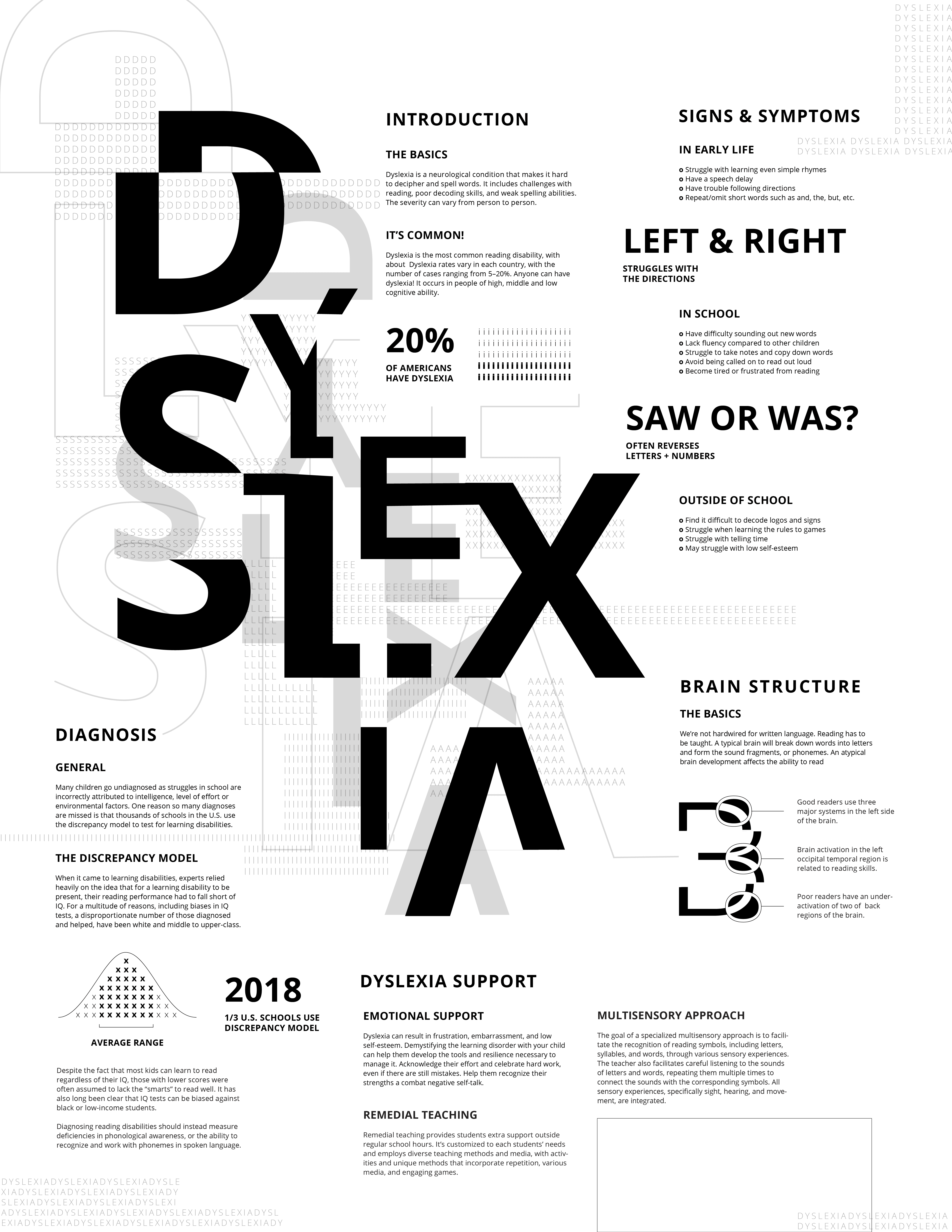
An infographic poster that educates and raises awareness on dyslexia using only typographic elements. By relying solely on type, the piece highlights both visual challenges and common misconceptions about dyslexia, encouraging readers to have greater empathy and insight.
An infographic poster that educates and raises awareness on dyslexia using only typographic elements. By relying solely on type, the piece highlights both visual challenges and common misconceptions about dyslexia, encouraging readers to have greater empathy and insight.
SPRING 2024
Design Elements
Design Elements
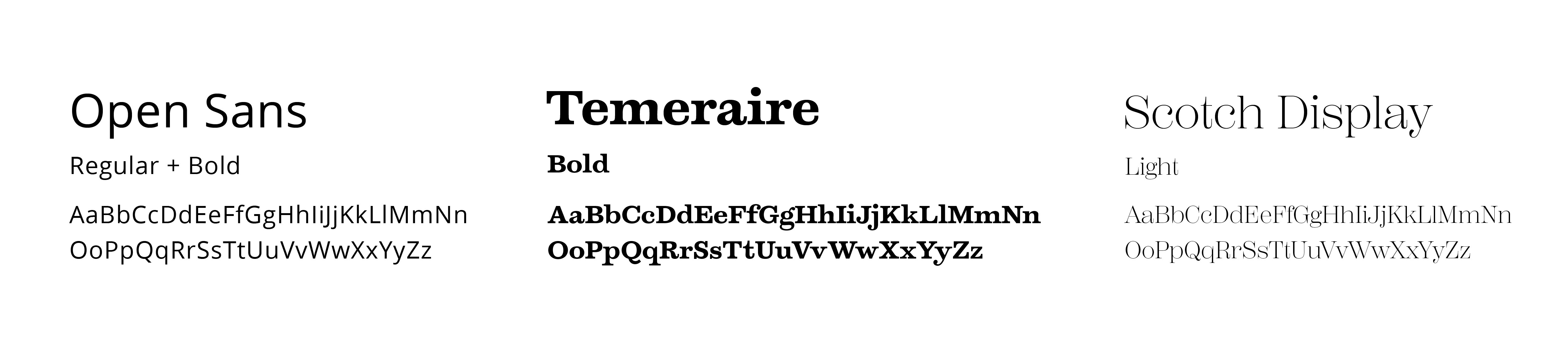
Open Sans was selected as the primary typeface. It is highly legible due to it's low contrast, open counters and humanist qualities. According to the British Dyslexia Association, Open Sans is one of the most legible typefaces for dyslexia.
Open Sans was selected as the primary typeface. It is highly legible due to it's low contrast, open counters and humanist qualities. According to the British Dyslexia Association, Open Sans is one of the most legible typefaces for dyslexia.
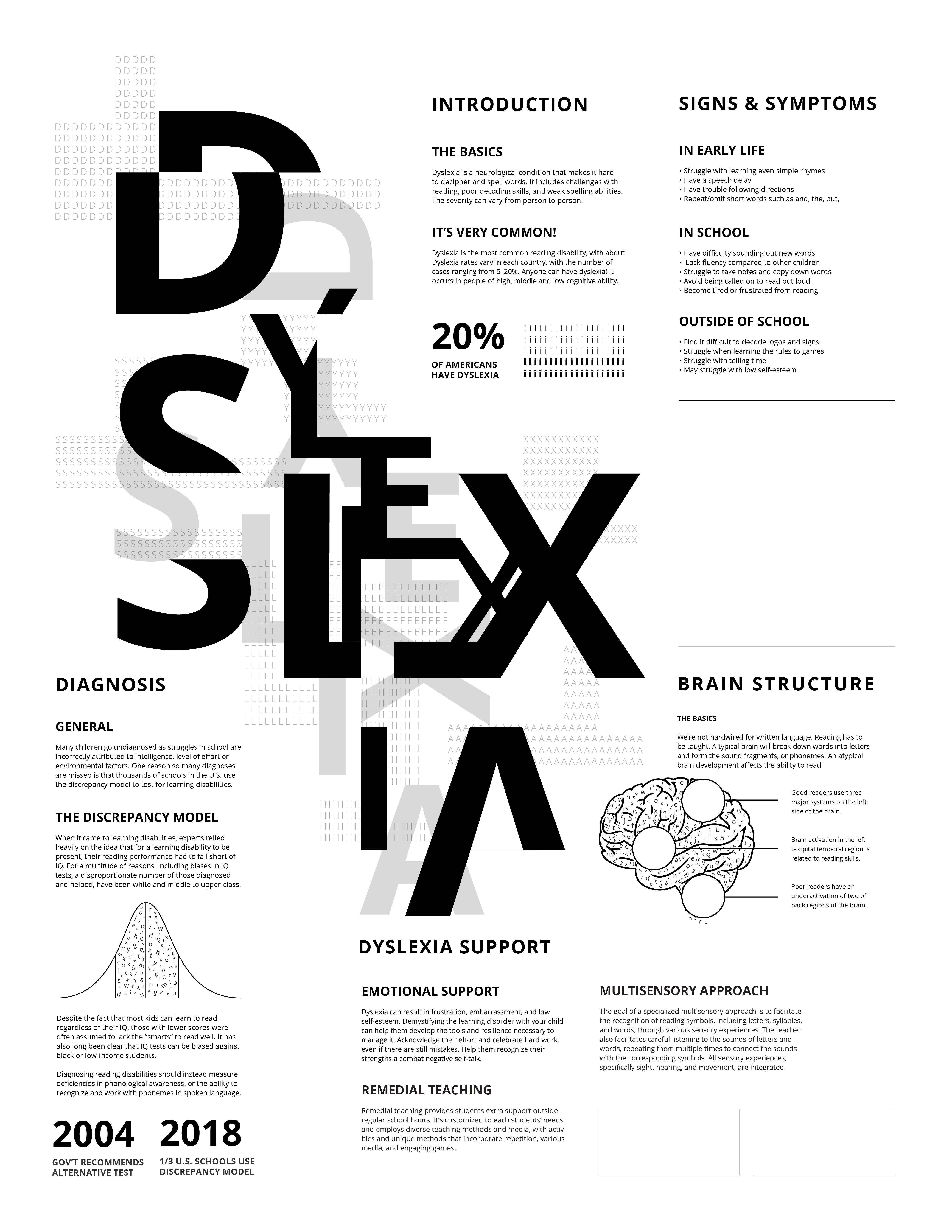
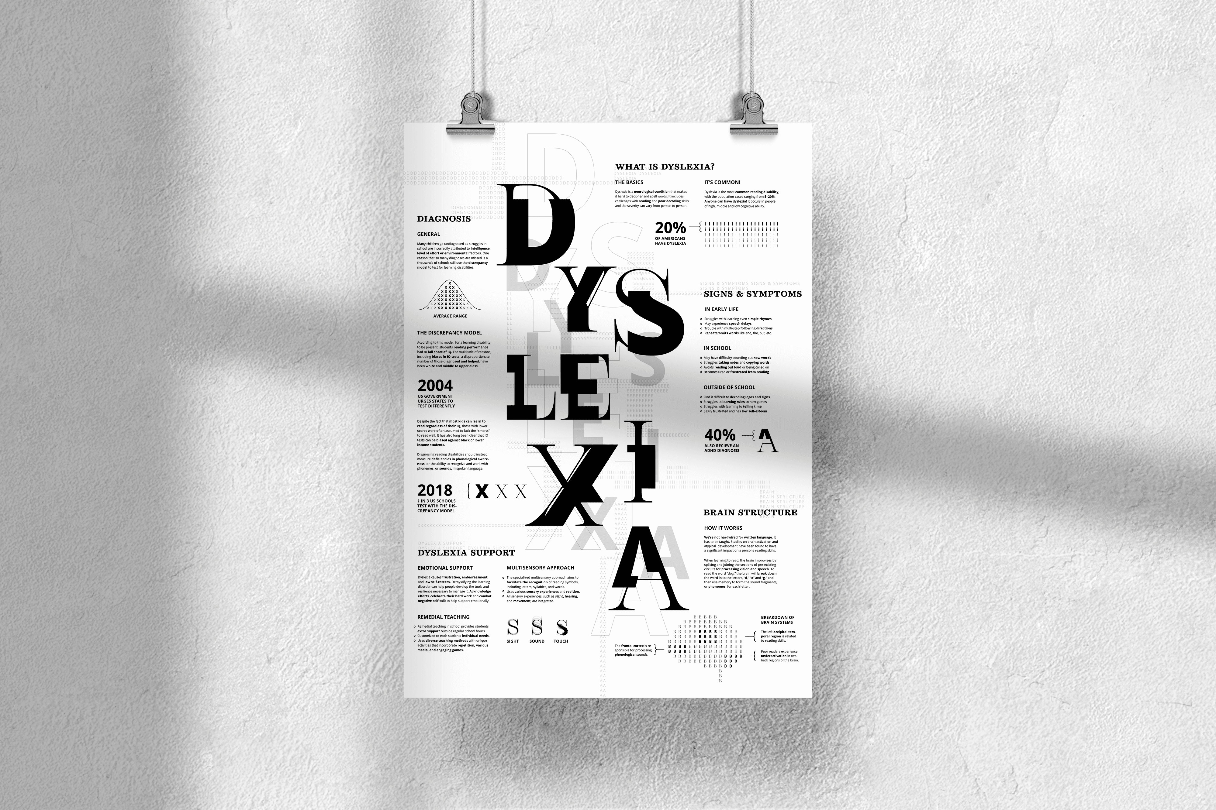
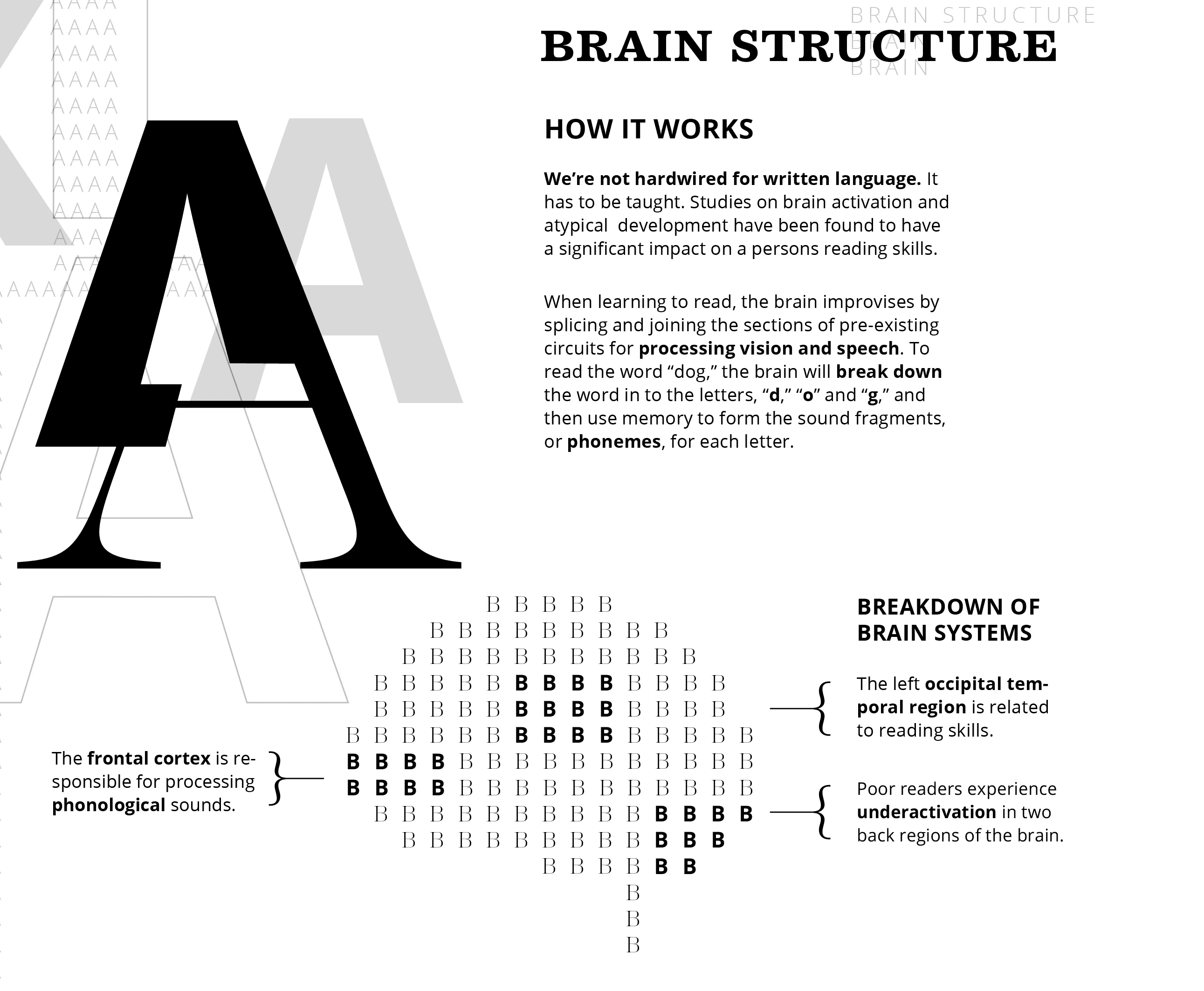
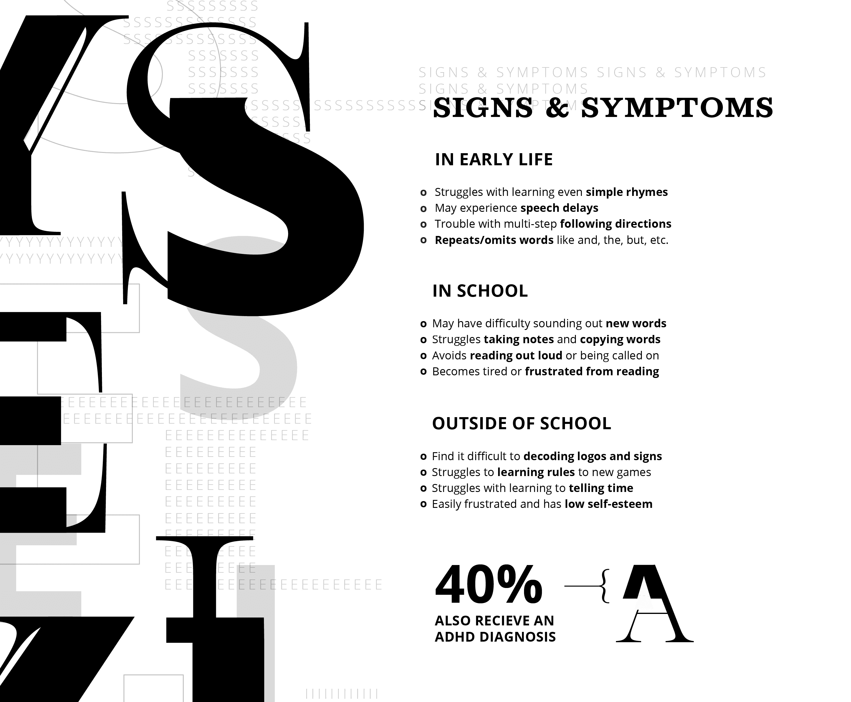
Typography functions as content and imagery. It provides insight into the subject matter while visually reinforcing the concept of decoding and chunking letterforms and words, a common challenge for individuals with dyslexia.
Typography functions as content and imagery. It provides insight into the subject matter while visually reinforcing the concept of decoding and chunking letterforms and words, a common challenge for individuals with dyslexia.
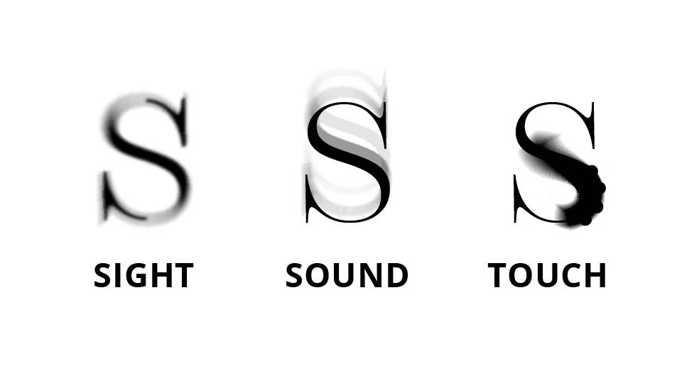
LETTER DISTORTION
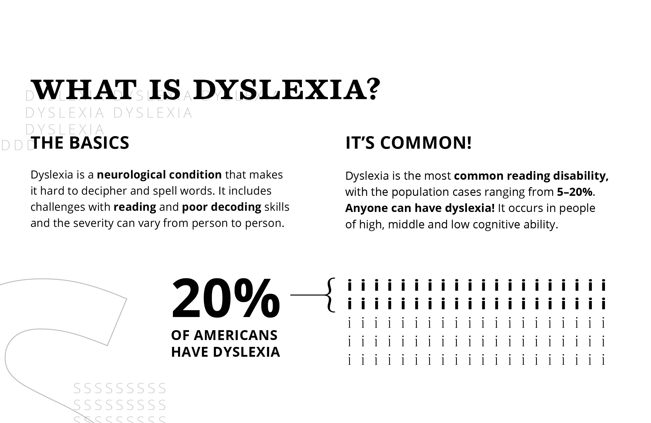
TYPE AS DATA
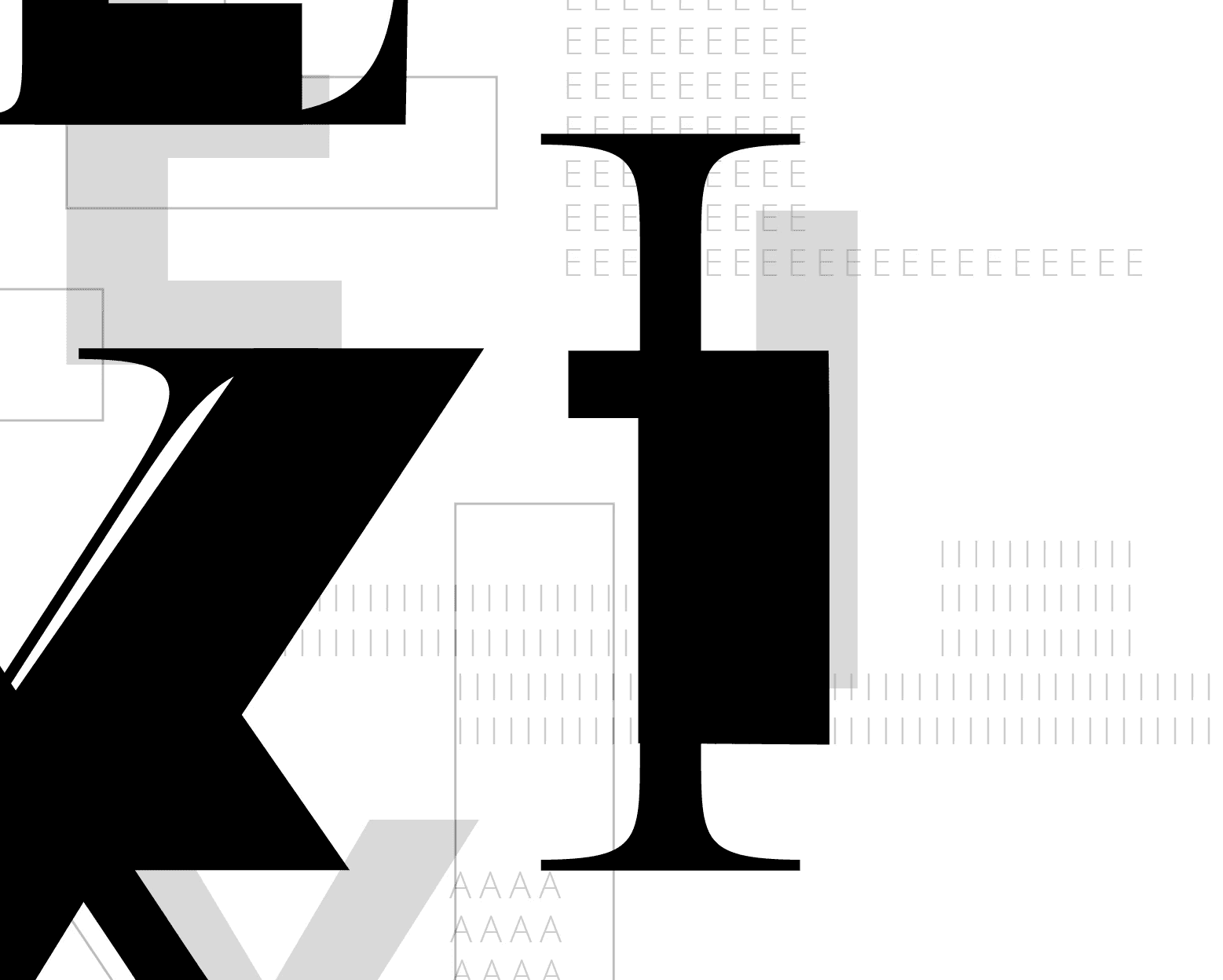
TYPE AS TEXTURE
Sketches & Digital Iterations
Sketches & Digital Iterations