Muse Kitchen Appliances
BRAND IDENTITY + MOTION GRAPHICS
SO DSGN is a branding and industrial design studio known for crafting thoughtful, story-driven designs. The studio takes great pride not only in its client work but also in internal projects that showcase their diverse skills. I had the opportunity to create the brand identity for a modern kitchen appliance line, an internal project led by the industrial design team.
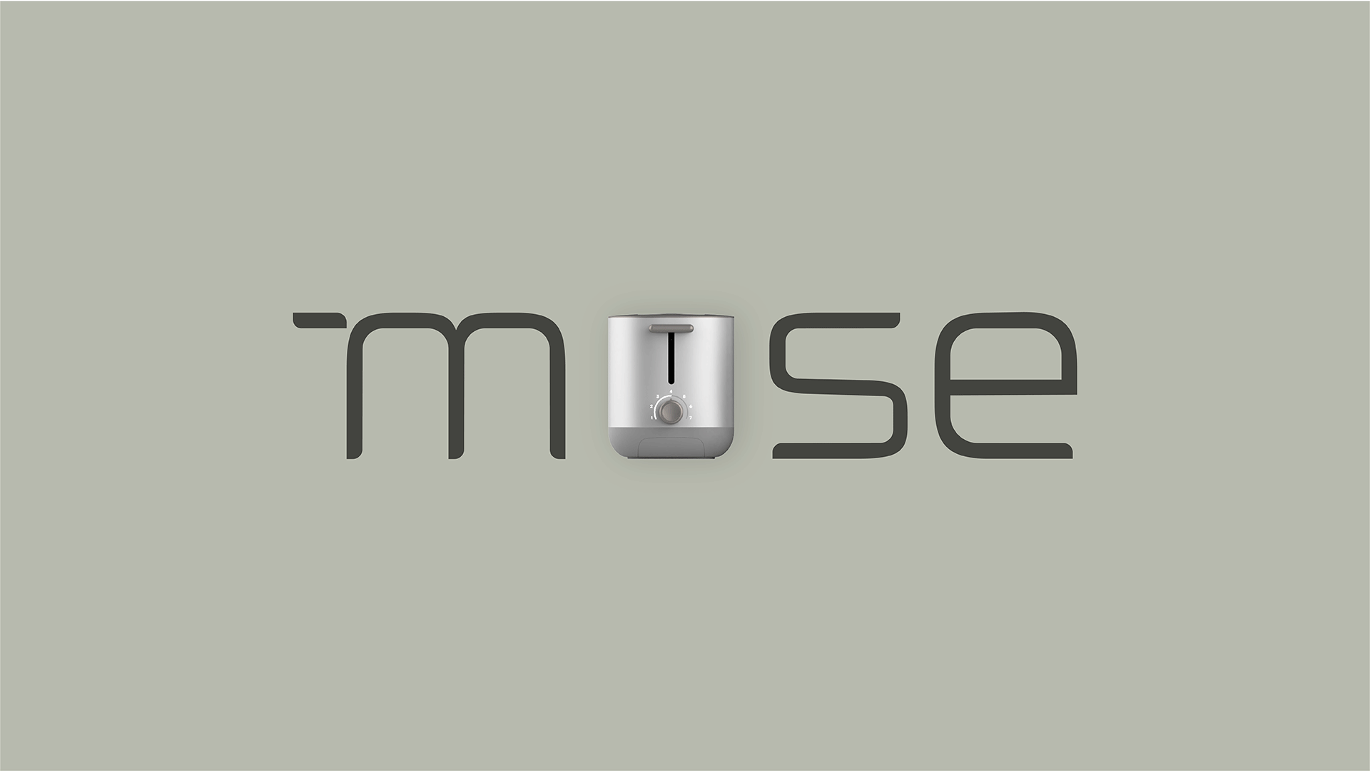
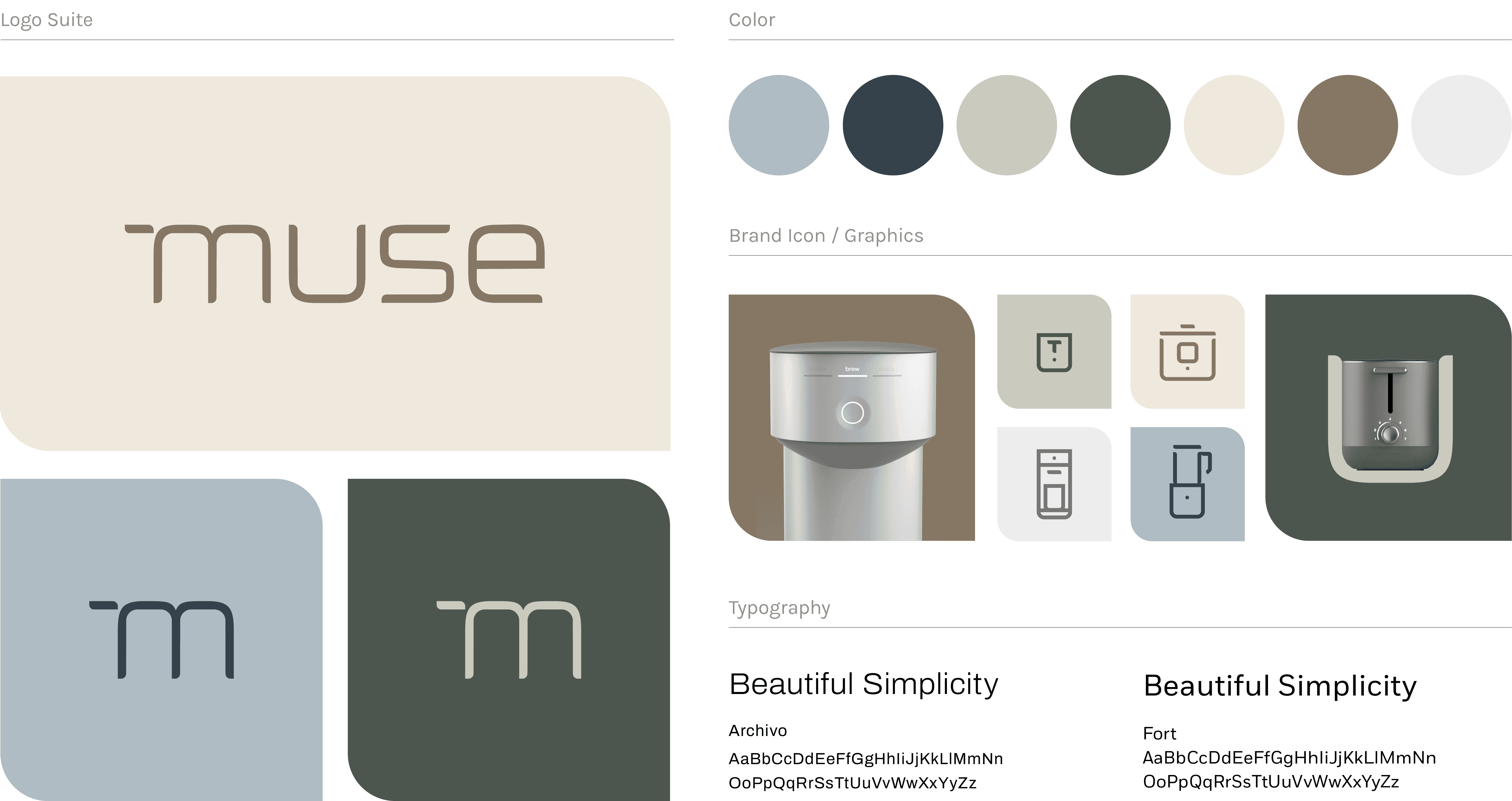
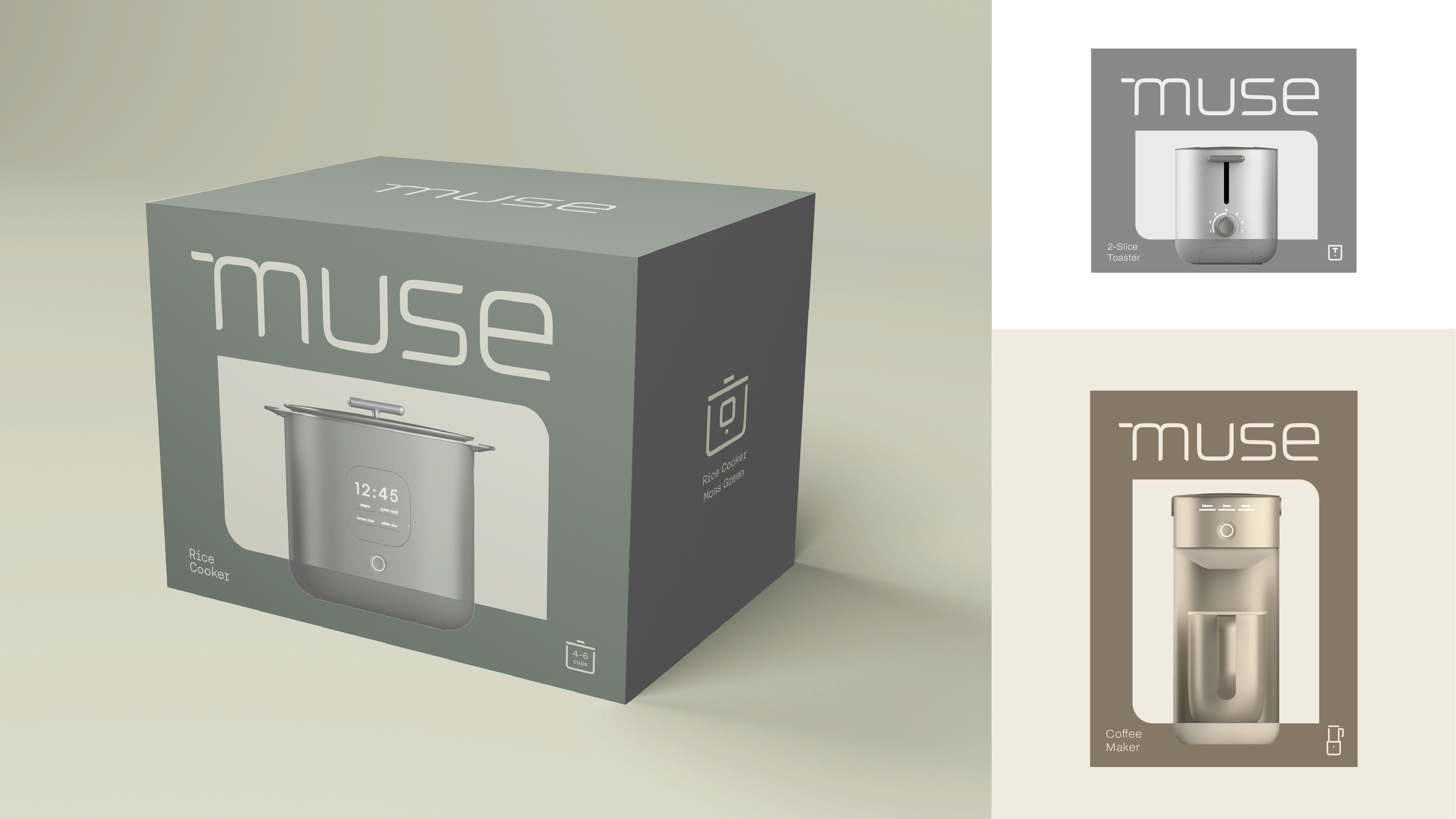
The Muse logo and brand identity directly reflects the product’s design language. This created a modular system that keeps the brand visuals consistent across all touchpoints.
SO DSGN is a branding and industrial design studio known for crafting thoughtful, story-driven designs. The studio takes great pride not only in its client work but also in internal projects that showcase their diverse skills. I had the opportunity to create the brand identity for a modern kitchen appliance line, an internal project led by the industrial design team.
The Muse logo and brand identity directly reflects the product’s design language. This created a modular system that keeps the brand visuals consistent across all touchpoints.
SUMMER 2024
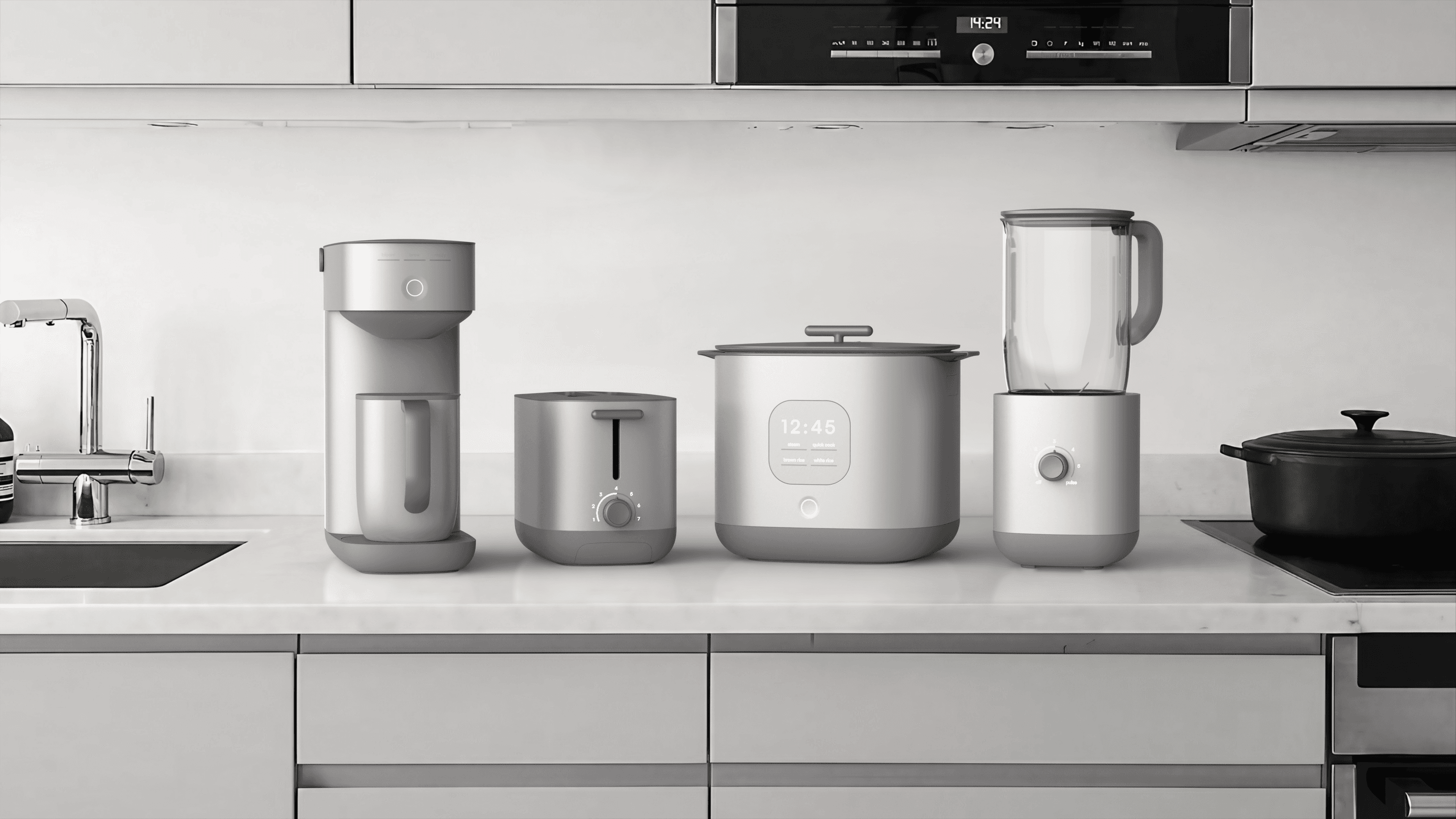

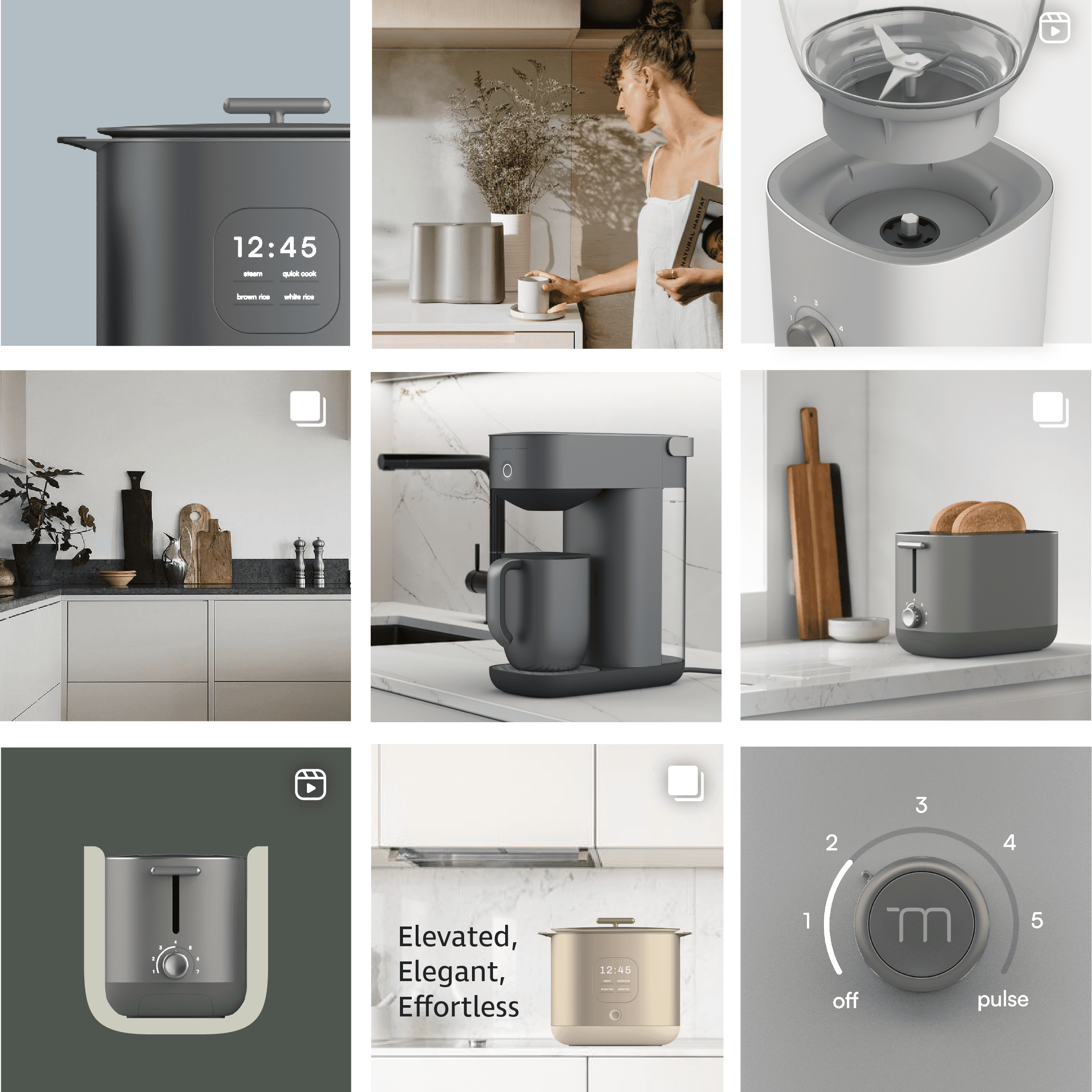
A modern kitchen appliance collection for small scale living that embraces the art of living simply.
A modern kitchen appliance collection for small scale living that embraces the art of living simply.

TARGET PERSONA
The Newcomer
TARGET PERSONA
The Newcomer
Starting a new chapter in the city, this user aims to create a unified, modern kitchen with upgraded appliances, and establish a holistic living space.
Starting a new chapter in the city, this user aims to create a unified, modern kitchen with upgraded appliances, and establish a holistic living space.
KEY DEMOGRAPHICS
• Men / women
• 25-35 year olds
• Metropolitan areas
• Small living space
• Men / women
• 25-35 year olds
• Metropolitan areas
• Small living space
KEY CHALLENGES
• Lack of space
• Limited free time
• Acclimating to a new environment
• Lack of space
• Limited free time
• Acclimating to a new environment
Logo Design
Logo Design
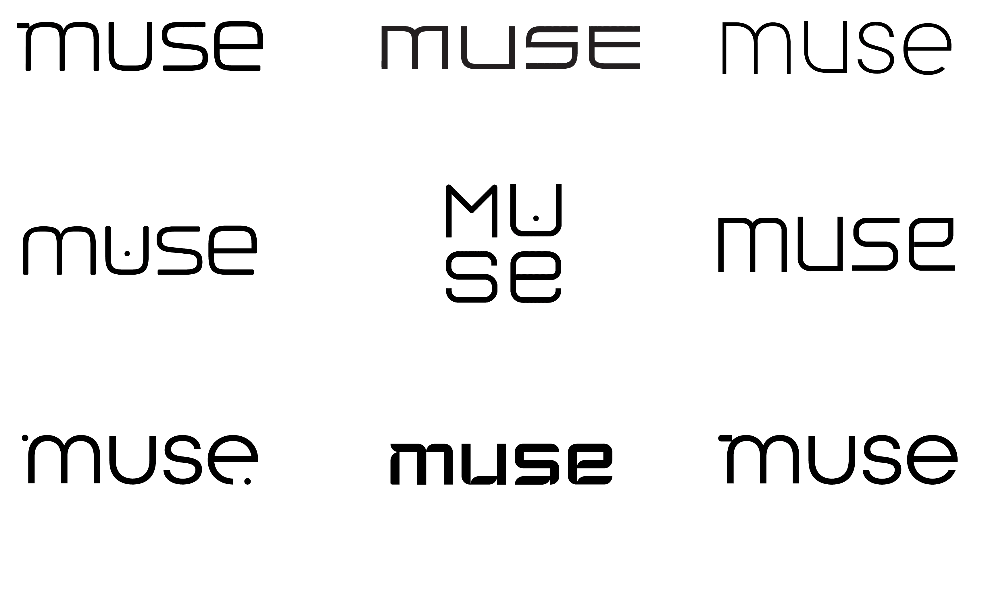
The logo design process was inspired by the appliance collection, looking for ways to seamlessly link the brand and appliances.
In the final logo, each letter shape pulls directly from the rounded base of the products. The horizontal line of the ‘M’ is a nod to the handle design and works both as part of the full wordmark and as a stand alone symbol for the brand.